Are you looking to increase your online conversion rates?
Are you tired of getting traffic but not having anything to show for it?
Do you need a way to turn traffic into committed customers – customers who generate revenue?
If so, you need landing pages.
A landing page, in a nutshell, is a single page that has one goal and that is tied to a specific advertisement or link on the Internet. When people click on a link or click on an online ad, the landing page is the first page they see.
A landing page is designed with one purpose: to get visitors to perform a desired action, whether buying a product or filling out a contact form.
For example, a software company has an ad for a new anti-virus program.
When visitors click on the ad they are taken to a landing page, which seeks to persuade them to try a free demo. The landing page is a success if the visitor agrees to do the free demo.
At the end of the day, landing pages are designed to help you turn traffic into conversions – into customers who are interacting with you the way you desire. Whether it is buying a product, calling you for more information, or giving you their email address, they are taking action – and you benefit.
Throughout “A Business Owner’s Guide to Building High Converting Landing Pages” you will learn the following:
• Why Landing Pages Matter
• The Elements of the Best Landing Pages
• Tying Landing Pages into Your Digital Marketing Strategy
• Tracking and Measuring Landing Page Effectiveness
Let’s get started!
- What is a Landing Page?
- Why Landing Pages Matter
- What is landing page optimization?
- What Is The Difference Between The Homepage And A Landing Page?
- Elements of the Best Landing Pages
- The Anatomy of a Landing Page
- How to Create a Landing Page in WordPress Using Elementor
- How To Create a Landing Page in WordPress: Step-by-Step Guide
- Additional Tricks: Sticky Menu and Anchor
- Final Trick: Hiding the Navigation
- Let's See the Result…
- How To Build A Landing Page With Elementor
- Designing an Effective Landing Page — 8 Best Practices
- Common Landing Page Mistakes (and How To Avoid Them)
- Tying Landing Pages into Your Digital Marketing Strategy
- Tracking and Measuring Landing Page Effectiveness
- Conclusion
- Time To Build Your Landing Page
- Need help with building high-converting landing pages? consider hiring a landing page design agency
- Let us be your landing page design agency
What is a Landing Page?

A landing page is a web page that allows you to capture a visitor’s contact information through a form or other means.
Once the visitor has submitted their information, they are “landed” on a thank you page or some other confirmation message.
The purpose of a landing page is to convert visitors into leads, and the best way to do this is by offering something of value in exchange for their contact information.
This could be an eBook, white paper, coupon, free trial, etc. – anything that would be appealing to your target audience.
If you’re running any kind of online marketing campaign – whether it’s pay-per-click (PPC), search engine optimization (SEO), social media marketing (SMM), email marketing, etc. – then you need to have at least one corresponding landing page for each campaign in order to maximize your leads and conversions.
Why Landing Pages Matter
In one word: conversions. Landing pages are designed with the goal of helping increase conversions and therefore helping you to achieve your business goals.
If your goal is to get someone to download an eBook, for example, then the entire page would be focused on that goal.
If you create an online ad that is designed to sell your new product or service, but the page that visitors go to when they click the ad is your homepage, you will likely lose your audience.
On the other hand, if you are selling a new antivirus program and when they click the ad they go to a page that only talks about that product, then your conversion rates skyrocket.
Along with conversions, landing pages are perfect for measuring by helping you to determine which ads are working best and which ones are not producing the desired results by measuring traffic.
For example, if your Facebook ad leads to Landing Page A, but your Google ad leads to Landing Page B, if you are getting more traffic and conversions to Landing Page A and the only difference is where the ad is located (Facebook vs Google), then you may wish to increase your Facebook ad budget and reduce your Google ad budget.
The bottom line is simple: Landing pages give you the best chance to convert a visitor into a customer.
What is landing page optimization?
Landing page optimization (LPO) is the process of optimizing a landing page to improve conversion rates.
There are a number of factors that can be optimized on a landing page, including the headline, copy, images, call to action, and form.
By optimizing these elements, you can increase the likelihood that visitors will take the desired action, whether that’s subscribing to a newsletter, downloading a white paper, or making a purchase.
LPO is an important part of any conversion rate optimization (CRO) strategy. By optimizing your landing pages, you can improve your overall conversion rate and get more value from your marketing campaigns.
What Is The Difference Between The Homepage And A Landing Page?
A homepage is the main page of a website and is typically used to provide visitors with an overview of the site and its content. A landing page, on the other hand, is a specific page that is designed to convert visitors into leads or customers. Landing pages are usually standalone pages that are not linked to the rest of the site, and often have a different design than the homepage.
Elements of the Best Landing Pages
Now, you know that landing pages are great for your business, but what are the elements of the best landing pages?
Title with Keywords
Your title page should be very similar to the text from the ad that brought them to the page. The first thing the visitor will do is make sure the page they landed on is relevant to what they clicked.
For best results, the landing page should also include relevant keywords.
Graphics / Videos
The best and most effective landing pages also have graphics and videos. In fact, landing pages that include videos have an 80% higher conversion rate!
Call-to-Action
Whether it is a form that gathers their contact information, a download button, or a printable coupon, each landing page should have one call-to-action, and it should be the focus of the entire landing page.
Compelling Copy
You should use clear, concise, and conversion-focused copy (text) on your landing page. Bullet points are always great and help to break up the content in a visually appealing way.
Testimonies / Client Quotes
It is always great to include short testimonies or client quotes to help prove validity and to increase results.
Social Media Share Buttons
You want to also give people the opportunity to share your landing pages on their own social media platforms; therefore, always include social media share buttons to make sharing easier.
Thank You Pages
Every landing page should have a “thank you” page. When someone performs the desired call to action, it will take them to the thank you page, which you can then quickly and easily use for conversion tracking and measurement.
In addition to the above, the best landing pages use contrasting colours, include your business
logo, and are clean (not cluttered).
The Anatomy of a Landing Page
Before we discuss how to design a landing page, let’s look at the different components it will likely contain.
Above the Fold Elements
The portion of your page that’s visible to a user without scrolling or clicking is considered ‘above the fold’. Since it’s the first content a visitor sees, you’ll want to take advantage of this valuable real estate.
In the following example from Miro, you don’t have to scroll to understand what the business offers and reach out:
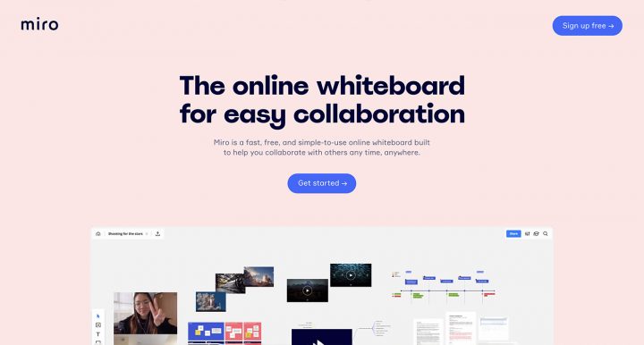
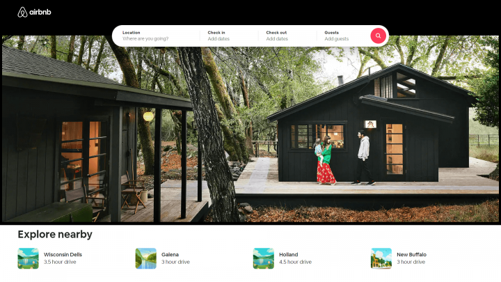
You’ll often find that the ‘hero section’ is placed above the fold. A hero section is typically a large banner image at the top of the page, although it isn’t limited to static images. You can use animations, sliders, or even just eye-catching typography.
For example, Airbnb provides information specific to your location in this element:
Whatever you choose to include above the fold should demonstrate a strong sense of what your landing page is offering. Then you can provide more detailed information in the page’s ‘below the fold’ content.
Content
Your content likely makes up the majority of your landing page. Content is used to speak to your audience and persuade them to take action on your offer.
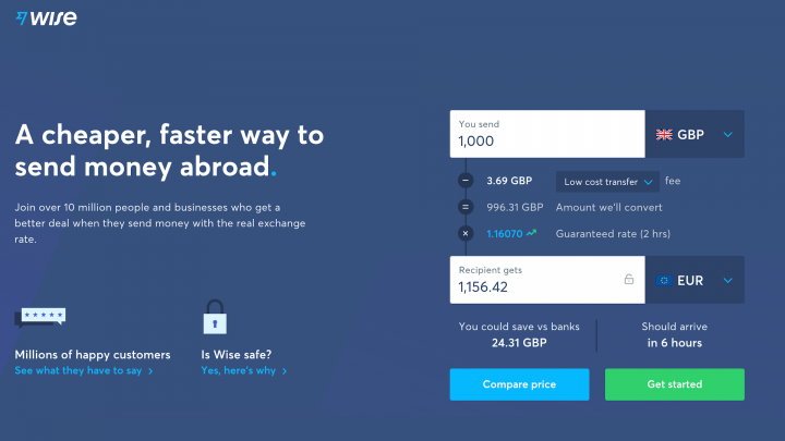
You can include descriptions of your product or service’s features and benefits, as well as pricing and other information. Wise’s landing page provides a calculator that you can use to work out how much money you’ll save by using this service:
While the content may be text-heavy, remember that you can include other media as well. You have plenty of freedom regarding what to include in your content, but there are a few elements you won’t want to leave out.
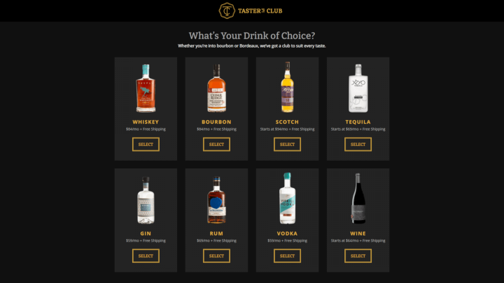
For example, you’ll probably want to mention your Unique Selling Point (USP):
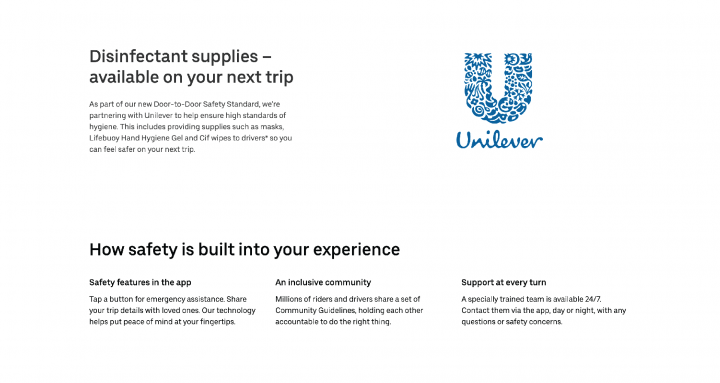
This is where you can show off a bit and let your audience know why your offering is superior to the competitors. Unilever promotes guidelines and commitment to safety:
Social proof is another helpful type of content that can build credibility and trust. This social content can take several forms, including positive reviews from customers or press coverage from respected publications in your niche.
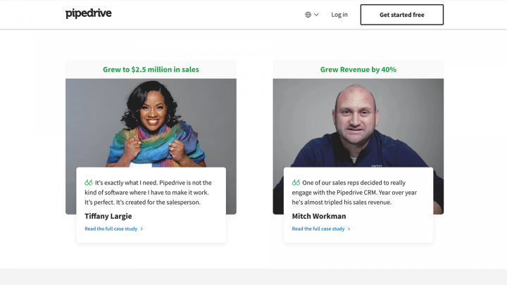
For example, Pipedrive displays statistics as well as user reviews:
If you’re just starting out, you may not have much in the way of social proof yet. Don’t be afraid to ask for feedback from users, so you can start building out this part of your landing page as soon as possible.
Conversion Elements
Conversion elements play an essential role in turning visitors into customers. The type of conversion you’re aiming for will depend on the purpose of your landing page.
If you have an e-commerce site, you’re likely hoping to sell a product. However, if you want your landing page to build your email list, a successful conversion could be a newsletter signup.
Regardless of the type of conversion you’re after, strong Calls to Action (CTAs) can help you accomplish your goal. A CTA is your opportunity to ask the visitor to perform a specific action.
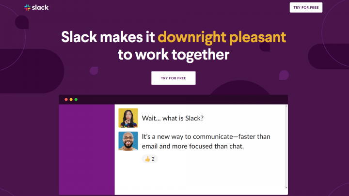
If you’re trying to build an email list, your CTA could be a button asking users to “Sign Up Now”. You can also make your buttons more appealing by using words such as “free”, as Slack does here:
While this may sound simple, you’ll likely spend a lot of time tweaking your CTAs. In addition to enticing copy, you’ll also want to carefully consider placement and colors.
Footer
Many people overlook the footer, but it plays a very important role in conversions. You can include additional information and lead generation forms for newsletter signups or even social media links like in the example we see below.

Design a footer specifically for your landing page, and limit menu links that navigate the users away from it. Having no distractions, visitors are more likely to complete the CTA successfully.
How to Create a Landing Page in WordPress Using Elementor
In this guide, we’ll go over how to build and design a landing page in WordPress, using Elementor. We will cover the essential steps and guidelines you need to follow to create an effective design.
There are many ways to build successful landing pages.
“Why follow this particular tutorial and not others?” you might ask.
This step-by-step tutorial has several key advantages:
- Free landing page builder – You will be building a landing page with our leading free WordPress landing page builder with no additional WordPress plugins.
- No coding – You won’t have to deal with a single line of CSS or PHP code, and also won’t need to deal with child themes – or any technical know-how for that matter.
- High Conversions – We put focus in this guide on reaching a landing page that not only looks beautiful but is built to generate higher conversions.
How To Create a Landing Page in WordPress: Step-by-Step Guide
Now that you know what landing pages are and why they’re useful, let’s get into how you can create a dedicated landing page for your WordPress website.
To create your landing pages, you can use Elementor and its visual drag-and-drop design interface.
Why use Elementor instead of the default WordPress block editor? Well, there are a few reasons:
- Visual, drag-and-drop design – Elementor gives you access to a much more powerful visual, drag-and-drop design editor. Because you have more control over your design, you can make sure that every part of your landing page is perfect.
- Blank canvas template – Elementor lets you build your landing pages using a blank canvas that hides your header and footer, which the block editor doesn’t offer by default. As we discussed above, hiding navigation is a good practice for landing pages because it lets you remove distractions and focus your landing page on pushing users towards a specific action.
- Landing page management – Elementor gives you a dedicated landing page management area. This lets you keep your landing pages separate from your regular content pages.
- Marketing elements – Elementor includes tons of built-in marketing elements that help you optimize your landing pages and eliminate the need to use third-party plugins. For example, you can add forms using the Form widget and easily integrate with your CRM or email marketing service.
- Landing page templates – while Elementor makes it easy to build great-looking landing pages from a blank canvas, you also have the option to import one of Elementor’s professionally designed landing page templates and then customize it to your needs.
Are you ready to build your first landing page? Here’s how it works:
Initial Setup
To follow this guide and create your own landing page, you’ll need three tools:
- A WordPress site (required)
- The free Elementor plugin (required)
- Elementor Pro (optional, but very useful for landing pages)
WordPress provides the baseline functionality for your website and your landing pages. If you’ve already built your main website with WordPress, you can use that same WordPress install for your landing pages. If you don’t have a WordPress site yet, you’ll need to create a fresh WordPress install before continuing.
Once you have a WordPress site, the Elementor plugin adds the visual, drag-and-drop design interface that you can use to create your landing pages. The Elementor plugin is free and available at WordPress.org – you can install it by going to Plugins → Add New and searching for “Elementor”.
Elementor Pro extends the free Elementor plugin with a number of features and design options that can improve your landing pages. For example, Elementor Pro gives you the Form widget, which you can use to create all kinds of opt-in or lead-capture forms. To use it, you’ll need to purchase Elementor Pro and then install it on your site alongside the free Elementor plugin.
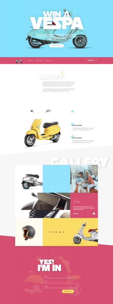
The Landing Page You’ll Build
You will be creating a page that includes:
- Top section — This takes most of our screen space. It’s made of a headline title, some text, and a call to action button – that will lead the user to our form.
- Navigation Menu section — This area helps the site visitor to quickly navigate to any part of our landing page.
- About section — An important section that tells our visitors more about our business or service.
- Features section — A list of features, with a big image on the left.
- Gallery section — For this section, we created a unique gallery layout using a combination of widgets, with some images, text, social icons, and video background.
- Form section — Here, we included a contact form which will allow our visitors to easily connect with us.
So that’s it — let’s start!
Step 1: Create a New Landing Page
As we mentioned above, one of the advantages of using Elementor is that it gives you a dedicated interface to manage your landing pages instead of requiring you to mix them in with your regular WordPress content pages.
To create your first landing page, go to Templates → Landing Pages and click the Add New Landing Page button.
This will launch you into the Elementor editor. You can either choose one of the premade landing page templates or close the template library to build your landing page from scratch.
Step 2: Set Up Colors, Fonts, and Color Picker
Before starting the actual landing page design, it is important to set up the visual editor correctly.
When you create a new landing page, Elementor will automatically apply the Elementor Canvas page layout. This gives us a “clean” page, without the header, footer, or sidebar. That’s a good option to go with when building a landing page.
We then set the default global colors as follows: primary is white, secondary, and text — black. The default colors will be automatically set when we add a new widget, making our job a whole lot easier.
Let’s do the same to fonts. I’ve set up my primary and secondary headlines font to an Adobe Typekit font (Restore), but you can set your own font as you wish.
With regards to the color picker, we set up our colors, so we can access them quickly while building the page.
Step 3: The Landing Page’s Top Section
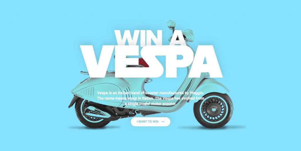
Our top light blue section includes the heading, text-editor, and button widgets.
What’s special here: The background image blend mode and the overlapping headings.
How we did it: We set the background color to blue. Background overlay gives us the option to set another layer on top, this time set an image overlay. Blend mode is a new option in Elementor 2.1. What it does is mix the overlay with the light blue background. We choose Multiply or Darken, and check out how this affects the image.
To get the heading overlap, we go to the first heading’s advanced settings and add a minus margin just to the bottom.
Step 4: Header & Navigation Area

The navigation area has 3 columns and includes an image widget, nav menu widget, and a button.
What’s special here: Navigation links that help the visitor scroll to the relevant point in the page.
How we did it: We will achieve this functionality later using the Anchor widget. The menu has 3 links: about, features and gallery. Each link is connected to the relevant section using a hashtag.
Step 5: About Area

The About area will be a one-column section. It will include the icon, heading, and text editor widget. This section is pretty simple. The heading has the same style as the top heading, we only changed the shadow a bit.
What’s special here: Icon appearing covered over by the heading
How we did it: We reduced the size of the icon and set a bottom minus margin.
Step 6: Designing a Features Area
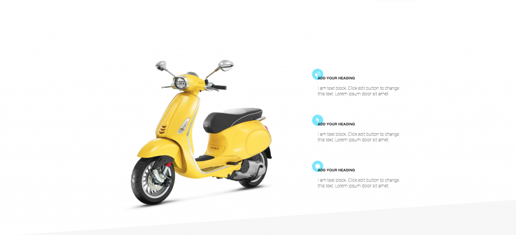
This features section includes a big Vespa image on the left and a list of 3 services on the right.
What’s special here: For this features section, we repeat the background icon effect we used in the previous section.
How we did it: To get this effect, we set the margin setting for the icon widget to 40px to the bottom margin, and -20 to the left. We can duplicate this first service 3 times.
- Tip — if you have a section or any other element you want to duplicate, first make it mobile-ready, and only then duplicate it.
Step 7: Gallery Area
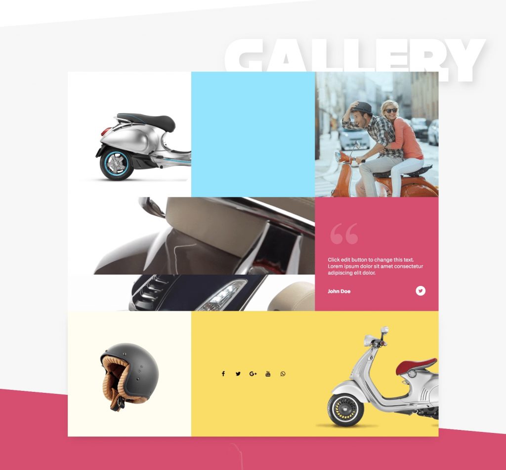
The next area we’ll add is the gallery. Here we have a big title, and a grid made up of call-to-action and other widgets.
What’s special here: A gallery grid make up with various widgets
How we did it:
- To create this gallery-like grid, we will use the columns widget to create an inner section.
- We will combine several widgets, and a background video, to create a uniquely styled gallery.
- We use the spacer widget, so we could set a background color to the left column. We do the same for the center column.
- We also add another Columns Widget section, and this time under style we’ll set a background type of Video. In the new Elementor 2.1, you can set a start and end time for the video. This is great for creating a background loop.
Step 8: Contact Area & Contact Form
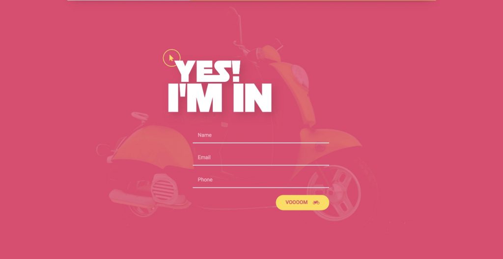
Here is our contact area, which is a vital part of every page that allows visitors to communicate with the site owners. Using Elementor’s visual form builder, we can easily set up a contact form and customize its style to fit the entire page. We can also seamlessly hook it up to an email marketing service like MailChimp using Elementor’s built-in form integrations.
What’s special here: Background blend mode effect
How we did it: We add an image overlay and set it with the blend mode Multiply setting.
Additional Tricks: Sticky Menu and Anchor
We want our menu to be sticky and to be kept on top when we scroll down.
What’s special here: Sticky menu with navigational links
How we did it: We will set this by choosing the edit section, advanced, scrolling effect, sticky top. We can set on which devices we’ll have it sticky, and also the spacing from the top. We also add anchors so the visitors will be able to navigate through the page easily. We do this by dragging an anchor widget in each section.
Final Trick: Hiding the Navigation
Now a little trick regarding the navigation; As you can see, the navigation area is visible throughout the site, but what if we want to hide it a little?
What’s special here: Hiding the navigation when the user scrolls past a certain point on the page.
How we did it: We’ll choose the navigation section, advanced, and under z-index give it a 1. Under the gallery section settings, style, give it a white background. And under the advanced tab, z-index set it to 2. This means it should cover the menu section. Let’s see if this works. We’ll scroll down, and check it out — the navigation is Gone.
Let’s See the Result…
Let’s view what we’ve created. Looks cool, right?
How To Build A Landing Page With Elementor
Use Landing Page Templates Instead of Building From Scratch.
In this post, you learned to build a landing page from scratch, as we went over the creation process every part of the landing page.
An alternate method is to use Elementor’s landing page templates and customize them for your needs. You can find more than a hundred full-page templates in Elementor’s free and Pro template library. Browse through the list and pick the ones that suit you best.
Another option is to use Elementor Blocks to quickly construct the various elements of your landing page. The Blocks categories include hero, call to action, FAQ, services, and other sections you are likely to need.
Designing an Effective Landing Page — 8 Best Practices
Now that you understand the importance of the various elements, you can use them to build an effective landing page. Below are eight best practices to consider along the way.
1. Keep Your Landing Page Simple
Minimalism can be effective when it comes to web design. A simple design can help to set off your images and CTAs, as seen on Pocket’s landing page:
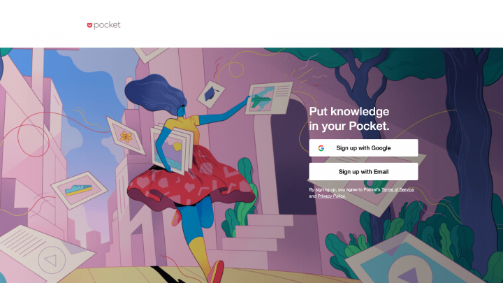
You don’t need to be a design expert to create a minimalist landing page. However, there are a few principles to keep in mind.
First, try to include plenty of white space. This can encourage users to focus on the critical parts of your page, without feeling overwhelmed by a lot of input.
You may also want to understand flat design, in order to keep your landing page minimal but still functional. Flat design uses safe, simple typography, grid-based layouts, and an intuitive interface.
However, it is possible to oversimplify your design to the point that it’s difficult to use. To avoid that, you can make your interactive elements stand out a bit by adding some shading.
Oscar’s landing page is a beautiful example of this principle in action:
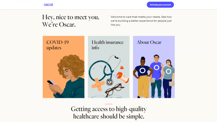
Symmetry is another important aspect of minimalist design. It’s pleasing to the eye and can help guide your users where you want them to go. Using Elementor’s Navigator can enable you to maintain symmetry throughout your landing page.
2. Show Your Customers That You Can Be Trusted
To earn potential customers’ confidence, you might want to include trust signals on your landing page. While it’s no surprise that most shoppers check online reviews before purchasing, other elements can also help to earn trust.
Online shopping has become commonplace, but people are still typically guarded when purchasing from an unfamiliar business. You may want to display the logos of payment processors you accept, such as PayPal, so shoppers know their information is protected.
If you offer a money-back guarantee, you might want to include this in a prominent place on your landing page, as Buffer does:
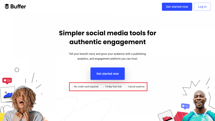
Earning trust is an important area where social proof comes into play. You might gather screenshots of positive discussions about your offerings to include in your landing page copy.
To easily add reviews from Yelp and Google, you can try Ultimate Addons for Elementor. The Business Reviews feature pulls content directly from these platforms and adds it to your site.
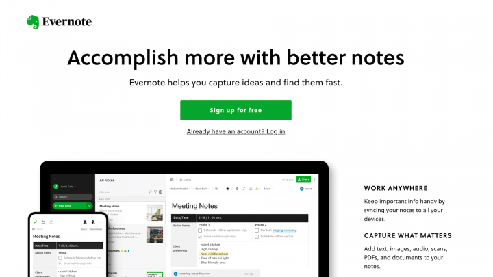
3. Write Concise Headlines
The web values concise writing, mainly because people tend to skim web pages rather than read them deeply. Keeping your headlines brief and to the point can help users find the information they’re most interested in.
Clear headlines also can summarize and emphasize key benefits, as demonstrated by Evernote:
In addition to your headlines, you may want to keep the rest of your content equally scannable. One way to do this is by using frequent subheadings and keeping your paragraphs short.
Writing powerful headlines takes some practice. If you’re stuck, you can use a headline template to get started.
4. Optimize Your CTAs
CTAs are a combination of design and copy, so there’s plenty of room for creativity and experimentation. These are a crucial part of your sales process, as they’re used to ask your audience to act.
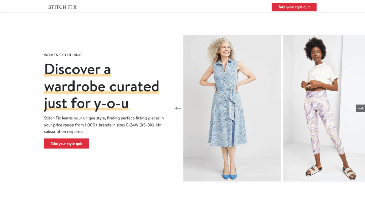
When writing the copy for your CTAs, try to be as specific as possible. Your users are more likely to take action if they know what you’re asking them to do.
Stitch Fix invites new customers to take a style quiz:
Also, it’s smart to be mindful of where you place your CTAs. If your landing page is long, you’ll want to include them throughout your content, so one will always be conveniently located when a user decides to take action.
You may want to have a CTA above the fold, as Dollar Shave Club does:

With so many possibilities involved in CTA design, you probably won’t get it perfect on your first try. You may want to perform A/B testing to guide you as you iterate on your landing page CTAs.
5. Make Your Landing Page Engaging
If your landing page is primarily text, there’s a chance that users’ attention will drift as they scan. To avoid this, there are a few strategies you can use to keep your landing page as engaging as possible.
One way to keep viewers scrolling through your offer is to include animation. You might use this to draw attention to your main points or keep it subtle with a parallax effect. If you’re concerned about the amount of text you need to explain your offer, you might want to opt for a video-only landing page.
When it comes to navigation on your landing page, you may also want to include few or no links that navigate away. These links can be the privacy policy, terms and conditions or even the main link from your logo. It is quite common, especially for campaigns, to see the main menu removed from the landing page. This promotes engagement and helps minimise distractions for your potential customers.
6. Build Forms With User Experience (UX) in Mind
User Experience (UX) covers all aspects of a user’s interaction with a website. It’s a vital web design component, as visitors who are frustrated or confused by your page will likely leave.
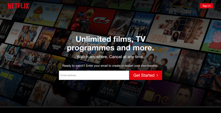
While you can apply UX principles to your landing page, you may want to be especially mindful of your forms. Forms are important for meeting many types of conversion goals, so you’ll want to make filling yours out as frictionless as possible.
Start by keeping your form simple and asking only for the information you need. For example, Netflix only requires an email to get started:
You can also keep the required fields to a minimum. This enables users to include more information if they wish, without forcing them into it.
7. Be Sure To Use Contrasting Colors
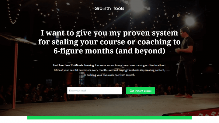
Using contrasting colors not only keeps your landing page visually interesting; it’s also an essential part of accessibility. This can be challenging when you include text over an image.
Therefore, you might use a background image overlay, as Growth Tools does:
To ensure that there’s enough contrast between your colors, try viewing your landing page in grayscale. You can use Elementor’s filter effects for an easy way to do this.
8. Use Legible Fonts
Typography is critical on the web. Along with poor contrast, font size is a common complaint among users. Therefore, you’ll want to pay attention to the fonts you include in your content, as well as your CTAs.
When choosing fonts, we recommend keeping the following tips in mind:
- Limit the number of different fonts you use across your site and landing page.
- Choose a font that can accommodate different screen sizes.
- Increase the white space between letters to improve the readability of your content.
- Remember that serif fonts work well for large chunks of text.
You can even use customized fonts with Elementor, so your landing page will be legible but still on-brand.
Common Landing Page Mistakes (and How To Avoid Them)
While every landing page is a bit different, there are some common mistakes that you’ll want to be aware of so you don’t make them yourself.
Low-Resolution Images
If you’re using a minimalist design for your landing page, your images will likely garner a lot of attention, so they need to look as crisp as possible. For this reason, it’s important to ensure that you’re using high-quality images and to use image software such as Adobe Photoshop or GIMP where appropriate.
However, large image files can negatively affect your WordPress site’s performance. This can be disastrous for your conversion rates. Walmart experienced sharp drop in conversion rates when its page load times ballooned from one to four seconds, so it’s important to strike a balance between high-resolution images and performance. Here, it may help to use tools to optimize your images without sacrificing quality.
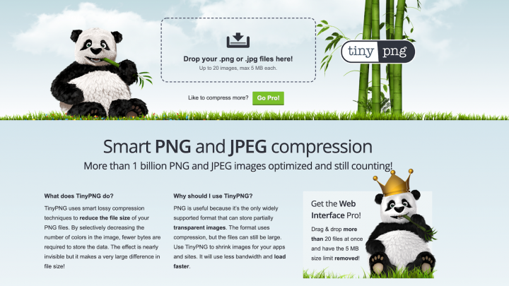
You might also compress your images using the TinyPNG website or WordPress plugin. TinyPNG selectively decreases the number of colors within your image. This can reduce the size and boost your landing page’s performance, without impacting the image’s quality:
There are also plenty of additional steps you can take to boost your landing page’s performance, including Content Delivery Networks (CDNs) and caching. As an added bonus these techniques will improve the performance of your entire website, and not just your landing pages.
Cold Outreach Messages
The language on a landing page can showcase a brand’s personality. If messaging is cold or flat, it won’t do much to entice customers. Try to keep language friendly and engaging, as Constant Contact does:
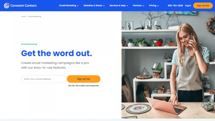
Constant Contact’s CTA as seen here is quite inviting, mentioning that there’s no risk or credit card required. The page also emphasizes that the product is easy to use.
Broken CTAs
If a CTA isn’t functioning correctly, you’ll likely miss out on leads. Even a well-designed CTA won’t be much use if it doesn’t work correctly.
When you’re setting up your CTAs, there are a few issues to look out for. If you’re offering a lead magnet, you’ll want to be sure the download works properly. If the offer arrives via email, be sure your site is sending email reliably. A customer not receiving a promised reward will likely end up with a poor impression of your business.
Also, it’s important to ensure that contact form entries route to the right person. This is especially important if you’re designing a landing page for a client, and won’t be receiving these notifications yourself.
Finally, be sure any CTA buttons are clickable and work as expected. A button that users can’t click on is confusing and can hurt the site’s UX.
The best way to ensure that your CTAs are working is to test them yourself. You may want to make a list of all the CTAs you’ve included on the landing page, so you don’t overlook any during testing.
Non-Scannable Copy
Since people tend to skim content on the internet, you’ll want to make your copy as inviting as possible. Large chunks of text can be an eyesore and may prevent users from receiving your message.
Blue Apron does an excellent job of laying out copy so that it’s easy to scan:
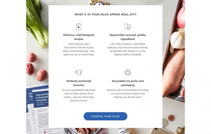
To keep text scannable, try to keep your sentences and paragraphs relatively short. You can also use frequent headings and subheadings to break up the text further. Finally, remember that bulleted lists attract the eye and are easier to read.
Tying Landing Pages into Your Digital Marketing Strategy
The key to maximizing your landing page effectiveness involves tying it into your overall digital marketing strategy.
Do you send out emails? If so, start directing some of those links to relevant landing pages and see if your click-through-rate and conversions increase.
The same goes for online advertising (Google Ads, Facebook ads, etc.) and even offline communications. You can even add landing page URLs to your direct mail campaign to help better track offline marketing methods.
In short, landing pages can be used in any aspect of your existing or future digital marketing strategy and can even help better determine the effectiveness of each ad, post, or email.
Tracking and Measuring Landing Page Effectiveness
Tracking and measuring landing page effectiveness is incredibly easy. The best way to do so involves adding a “thank you” page and then tracking the number of people who view the landing page and comparing it to those who view the thank you page. This method provides you a quick conversation rate.
Furthermore, A/B testing is a great way to determine which landing pages are performing better than others. You can even post a landing page without a video and then use the same landing page, with the only difference being that the second page has a video and then see if the video truly makes that much of a difference. If so, buy more videos!
Finally, the effectiveness of a landing page can be determined by how many people take the action you request of them. If 100 people visit the page, and 10 of them give you their email address, your landing page has an effectiveness rate of 10%. You can tinker with each page to
increase the overall effectiveness rate. If the landing page is tied to a product, you can even determine the return on investment by using the value of the product being sold and multiplying it by the number of people who buy it.
Conclusion
Landing pages are a great addition to any digital marketing plan and can significantly increase the number of conversions. It’s very difficult to have a successful, comprehensive digital marketing strategy without optimized landing pages that have been expertly tuned to deliver optimal results.
Landing pages are essential, period.
Time To Build Your Landing Page
Designing a landing page that’s simple, engaging, and converts is no small feat. With so many discrete sections and potential mistakes, it’s easy to become overwhelmed by the task. However, by focusing on one piece at a time, you’ll likely find it’s not as difficult as it may first appear.
Many of the landing page best practices we’ve covered emphasize clarity and ease of use. Ultimately, a simple design, concise content, and legible fonts can help lay the foundation for a successful page.
What do you think makes an effective landing page? Share your thoughts with us in the comments section below!
Need help with building high-converting landing pages? consider hiring a landing page design agency
If you’re looking to build a high-converting landing page, you may want to consider hiring a landing page design agency.
Here’s why:
1. They have the experience and expertise to design a landing page that’s both effective and visually appealing.
2. They can help you test and optimize your landing page to ensure that it’s performing as well as it can.
3. They can take care of all the technical details, so you can focus on running your business.
Hiring a landing page design agency can be a great way to get the most out of your landing page. If you’re not sure where to start, get in touch with us.
Let us be your landing page design agency
There are a lot of web design agencies out there. So why should you choose us to be your landing page design agency?
Well, for starters, we have a lot of experience. We’ve been in the business for years and have designed landing pages for all sorts of businesses, from small businesses to large corporations.
Second, we’re experts at what we do. We know all the latest trends and technologies and can design a landing page that not only looks great, but is also effective in driving conversions.
And last but not least, we’re passionate about what we do. We love designing landing pages and take pride in our work. We’re confident that we can design a landing page that you’ll be happy with.
So if you’re looking for a landing page design agency that can provide you with experience, expertise, and passion, then look no further than us. We’ll be happy to help you take your business to the next level.
Are you looking to take your business to the next step with landing pages?
Take the next step!
If you are interested in taking the next step to gain more customers and generate more content marketing to increase your bottom line, contact us today for a free digital analysis!



Pingback: Top 10 Best Landing Page Design Agencies and Platforms